Kaiser Permanente
UX/ UI Designer [2019]
Role & Responsibilities:
At Kaiser I contributed to design efforts as a part of the User Engagement & Enablement Team.
Together, we worked on multiple products that served Kaiser employees. These services included communications, application hosting, networking, device ownership and more.
Web & UI Design, System Architecture, Prototyping
Projects:
◆ WordPress to ServiceNow Migration
WordPress to ServiceNow Migration
Overview
Midway into my time at Kaiser our team got the directive to transfer all our existing products and services from WordPress to ServiceNow. This was quite the undertaking since we had hundreds of pages full of forms, apps, help guides and more on our site. Not only was the migration a large undertaking, but none of our team had any experience developing with ServiceNow. Through education and cooperation with outside teams we were able to migrate a majority of our content in roughly 7 months.
Objectives
- Migrate and convert our portals’ content and products into ServiceNow artifacts (Catalog Items & Knowledge Items)
- Retain as much functionality as possible
- Improve the UX of the ServiceNow Portal
Process
Our team had to work from the ground up – learning the intricacies of ServiceNow and adapting all our content to fit a totally different platform.
- Educating our team about ServiceNow
- Coordination w/ outside teams
- Deconstructing our site
- Planning and prioritizing what would be moved
- Designing new standards for the product
Re-inventory and Categorize Content
Our first step was to take inventory of all our content. Sure, we could see how many pages we had, but not all of the pages had high usage. This was an opportunity to slim down, restructure and revamp our content.
The less content we had to move over, the faster we could do the transition.
Deconstructing content that had been built over several years of design

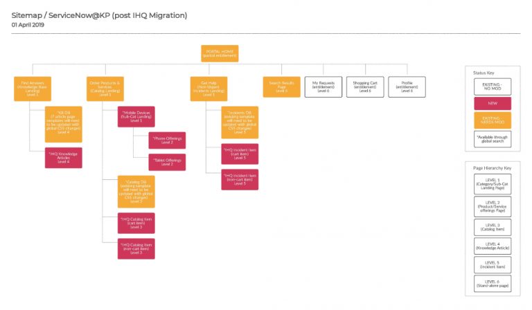
How Does Our Content Convert?
Understanding how to best fit our content into the types of content items ServiceNow uses was quite challenging. The three buckets ServiceNow uses are Knowledge Articles, Pages, & Catalog Items.
Each item has their own specific purpose and functionality. The kinds of interactions we needed for each piece of content had to be carefully thought out in order for the user to be able to find what they needed in an intuitive manner.
New System Architecture [SiteMap by YoungMi Kim]
Exploring a New Visual Language
Apart of the reason why our team was assigned to the ServiceNow group was our design resources. The team that was currently working on building up the ServiceNow platform was purely logistics and engineering. We had a chance with our migration to add some visual and ux intelligence to the system. Below are some of the design systems I created to update the platform.
Establishing Consistency
- Standardizing typography
- Removing redundant branding
- Finalizing universal footer content
- Establishing spacing guidelines
2019 Style Guide Update

Knowledge Articles before Revisions
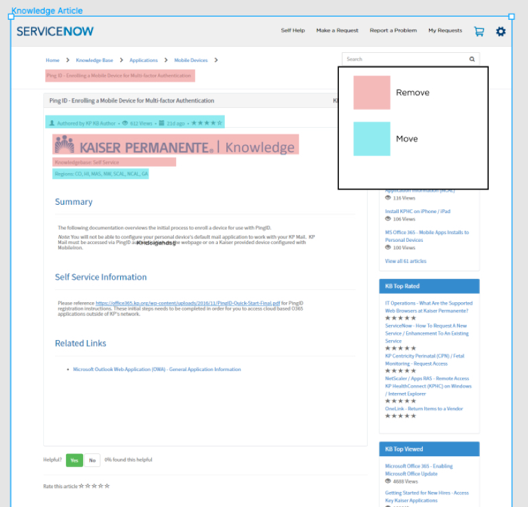
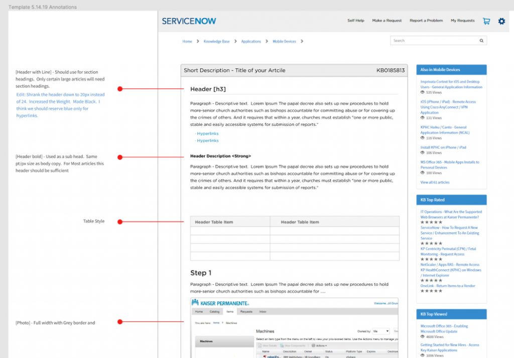
Updating Knowledge Article Formatting
New Landing Page with Space Guides

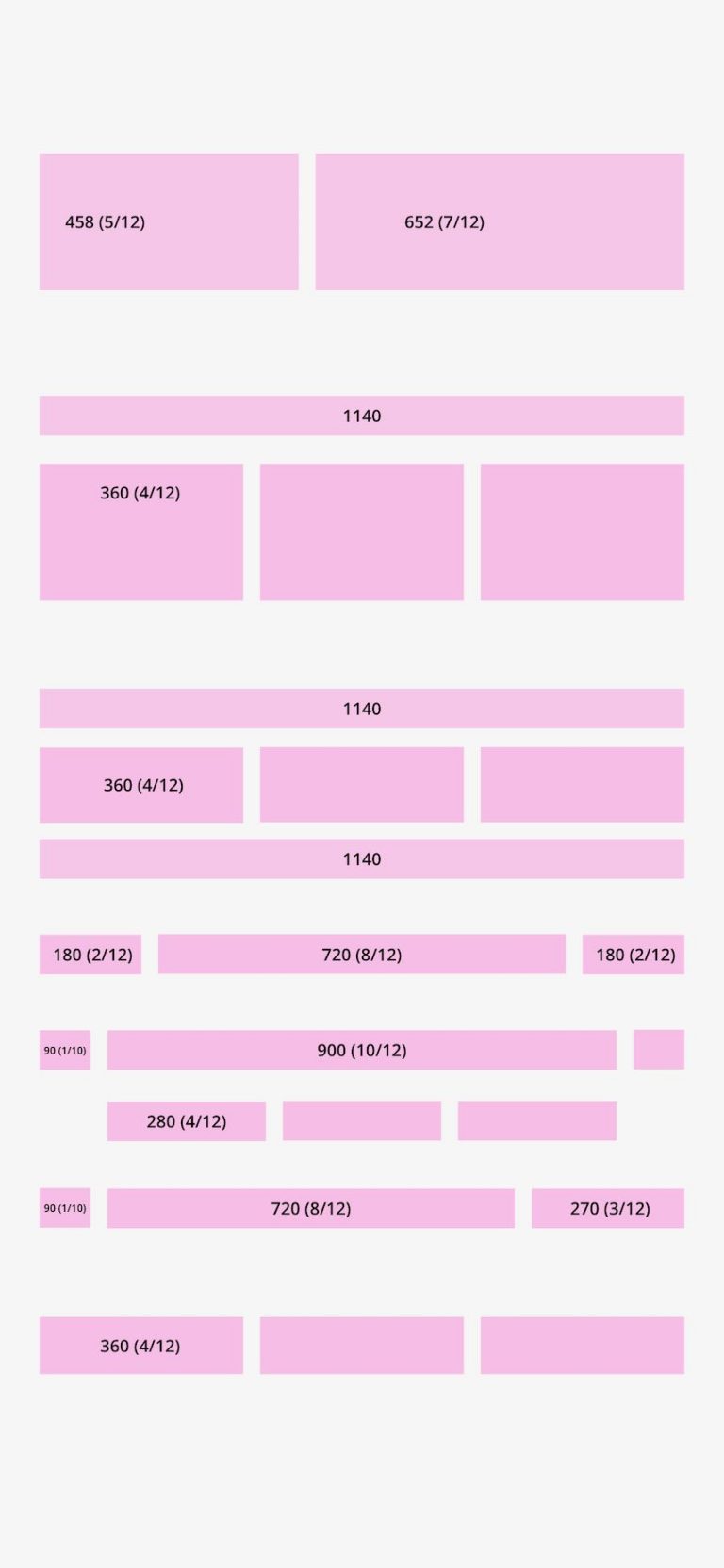
Column View (Desktop)
Outcomes
Working in congruence with outside teams we developed a consistent visual style to implement for knowledge articles and service pages. Although we did not manage all the content that would be added to the ServiceNow portal, we were able to establish some structural intelligence to how content should be categorized, added, and displayed for teams wishing to add information and services to the portal.
We were also able to slim down and cut our existing content by over 50%. Through trial and error we found out which content from WordPress could be migrated over through custom code and iframes. Unfortunately we were not able to replicate all functionality from our original portal, but our team was able to set up guidelines and help documents for future additions.
